
When you need to explain a complex new process, what’s your first instinct? Do you start talking, or do you grab a marker and head for the nearest whiteboard? If you're reaching for the marker, you're already thinking like a visual learner.
Think of them as the navigators on your team—they make sense of the world through maps, charts, and diagrams, not just a list of spoken directions. For them, seeing is understanding.
Understanding the Visual Learner in Your Workforce

In any corporate setting, you have team members who need to see information to truly get it. These are your visual learners, and they absorb and retain knowledge most effectively when it’s presented graphically.
This isn’t just a personality quirk; it directly impacts how well your training and development programs land. Visual learners thrive when they can connect concepts to images, colours, and spatial layouts. A dense, text-only manual can feel like an insurmountable wall of words, but a well-designed infographic conveying the exact same information can click into place almost instantly.
The Strategic Value of Visual Training
Thinking visually isn't just about accommodating a few people; it's a powerful strategy that elevates your entire training program. When you make your materials visually compelling, they become more engaging and memorable for everyone, dramatically boosting comprehension and retention across the board.
The very principles that make content effective for a visual learner—clarity, structure, and scannability—are rooted in the core adult learning principles that help all employees succeed.
This approach is especially critical when you realise how many people have a visual preference. For instance, a comprehensive survey in California of 10,000 students, highlighted by Gitnux.org, found that 35% identify as primarily visual learners. It’s a statistic that holds up in the modern workforce.
By building your training with a visual-first mindset, you’ll quickly see tangible results:
Accelerated Comprehension: A good visual can communicate a complex idea far more quickly than a block of text ever could.
Improved Knowledge Retention: Our brains are wired for images—we process them 60,000 times faster than text, which makes visual information much more likely to stick.
Greater Engagement: Dynamic, visually appealing content grabs and holds attention, which is your best weapon against training fatigue.
Ultimately, designing for your visual learners is a direct path to better operational efficiency and a stronger return on your training investment. It ensures that your most critical information isn't just delivered, but truly understood, remembered, and applied where it counts.
The Reality of Learning Styles vs. Learning Preferences
You’ve almost certainly heard of learning styles. The whole idea is everywhere, usually broken down into the classic VARK model: Visual, Auditory, Reading/Writing, and Kinesthetic. It’s a popular concept because it feels right—we all have ways we prefer to learn, so it seems logical that we each have one dominant style.
But here’s where we need to be careful. The scientific community has largely debunked the idea of fixed, rigid learning styles, putting it in the same category as other neuromyths like the old "we only use 10% of our brains" tale. While people absolutely have learning preferences, there’s very little solid evidence showing that teaching only to someone’s self-identified style actually helps them learn better.
The important distinction to make is between a fixed style and a flexible preference. Someone who prefers learning visually might get more out of a product demo, but that doesn’t mean they’re incapable of learning from a podcast or a well-written manual. Our brains are designed to take in information from multiple senses at once to build a rich, complete understanding of the world.
Why Visuals Work for (Almost) Everyone
This is where the conversation gets really practical. Instead of getting bogged down in the debatable theory of styles, we can focus on a proven strategy: presenting information in multiple formats, especially with strong visual support. This isn't about catering to a "visual learner," but about aligning with how our brains naturally work.
The real power isn’t in trying to match content to a learner’s supposed style. It’s about making information easier to process for everyone by presenting it clearly and in multiple ways. A good visual often does this better than anything else.
Think about the last time you assembled flat-pack furniture. Would you rather have a dense, 30-page text-only manual or a simple, step-by-step diagram? For nearly everyone, the diagram wins. It clarifies complex actions, shows how the pieces fit together, and cuts down on the mental heavy lifting required to get the job done. This principle is directly tied to a core concept in learning design; you can see how it works by understanding what is cognitive load theory.
At the end of the day, the goal isn't to put your employees in neat little boxes. The real takeaway is that incorporating strong visual aids—like charts, diagrams, and videos—makes your training more effective for your entire team. It creates a shared understanding that supports every preference, making sure your message isn’t just received, but truly absorbed.
How to Identify Visual Learners on Your Team
You don't need a formal test to spot a visual learner on your team. The clues are usually hiding in plain sight, woven into the fabric of everyday work. It all comes down to paying attention to how people communicate, process information, and organize their thoughts.
Think about the questions people ask. When a colleague says, "Can you draw that out for me?" or "Is there a diagram I can look at?", they're giving you a direct window into how they think. They’re looking for a visual anchor to ground the abstract information you're sharing.
It’s just as telling to watch how people explain ideas. Who’s the first person to grab a marker and head for the whiteboard during a brainstorm? That’s often your visual thinker. They translate concepts into workflows and diagrams, not just for others, but for themselves. They need to see the connections.
Observable Behaviours and Cues
Beyond these direct requests, a person’s daily habits often reveal a strong visual preference. These team members tend to surround themselves with visual information to keep their work and thoughts organized.
Look for a few common indicators:
Taking meticulous notes filled with doodles, arrows, and colour-coded highlights.
Preferring video calls over audio-only calls to pick up on body language and facial expressions.
Keeping an organized desk covered in sticky notes, calendars, and visible to-do lists.
Asking for a demonstration of a new task instead of settling for verbal instructions.
This kind of concept map perfectly illustrates the different ways people process information, placing the visual style within the context of the popular VARK model.
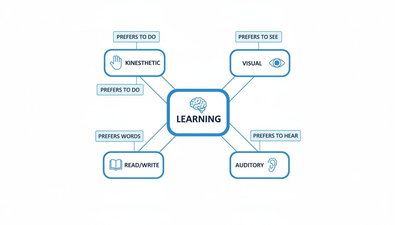
Seeing it laid out like this helps clarify how the visual preference sits alongside the auditory, read/write, and kinesthetic modes. Each one simply engages a different sensory pathway for learning.
A key thing to remember is that while these preferences are distinct, most people use a mix of them. The goal isn’t to put employees in a box, but to recognize their dominant tendencies so you can communicate and lead more effectively.
Comparing Communication Habits
Understanding these different preferences becomes a real asset when you can see them side-by-side. The way a visual learner approaches a project kickoff is fundamentally different from someone who leans toward auditory or kinesthetic learning.
Recognizing these distinctions helps you adapt your communication on the fly, making sure your message actually lands with everyone in the room. The table below gives a practical breakdown of how these preferences show up in common workplace behaviours.
Behavioral Indicators of Learning Preferences
Behaviour / Situation | Visual Preference | Auditory Preference | Kinesthetic Preference |
Giving Instructions | "Watch me do it first." | "Let me talk you through it." | "Let's do this together." |
Solving a Problem | Sketches a diagram or flowchart. | Talks the problem out loud. | Builds a prototype or model. |
Learning New Software | Follows a video tutorial. | Listens to a guided webinar. | Clicks through and explores. |
Responding to Feedback | "Can you show me what you mean?" | "Can you tell me more about that?" | "Let me try it again." |
Once you start spotting these patterns, you can connect more meaningfully with every person on your team. This builds a more inclusive and productive environment long before you ever launch a formal training program.
Actionable Strategies for Visual-First Training

Shifting from dense, text-heavy training to a visual-first approach is all about making your information intuitive. For people who learn best visually, this move from reading to seeing is the difference between a concept clicking into place or feeling hopelessly jumbled. These practical strategies are your guide to building training that actually connects.
Before you write another manual, ask yourself a simple question: How can I show this concept instead of just telling people about it? Here’s how to do it.
Simplify Complexity with Infographics
Infographics are one of your most powerful tools for turning dense data or confusing processes into a single, digestible image. Instead of a multi-page document on quarterly sales figures, you can tell the entire story with charts, icons, and a few key numbers in a vibrant infographic.
Actionable Tip: Take your next multi-step safety protocol and convert it into an infographic. Use simple icons for each step, use red for high-risk actions and green for safe ones, and connect them with clear arrows. This visual guide is instantly understandable and far more memorable than a text-heavy email.
Clarify Workflows with Process Maps and Flowcharts
For a visual learner, truly understanding a system means seeing how all the parts connect. Process maps and flowcharts are perfect for this, turning abstract workflows into concrete, step-by-step diagrams that are easy to follow.
Actionable Tip: Map out your employee onboarding process visually. Instead of a checklist, create a flowchart:
Box 1: New hire signs offer letter.
Arrow to Box 2: HR sends welcome package (use a document icon).
Arrow to Box 3: IT sets up equipment (use a computer icon).
Arrow to Box 4: First-day orientation with manager (use a calendar icon).
This visual roadmap gives new hires a clear mental model of what to expect, reducing first-day anxiety and improving their experience.
By translating procedures into visual maps, you're not just creating instructions; you're building understanding. This method allows a visual learner to internalize the "why" behind each step, not just the "what."
Boost Engagement with Video and Microlearning
Video is the undisputed champion for visual learning. It combines images, movement, text, and sound to create a rich experience that’s perfect for demonstrating tasks, running simulations, or telling a compelling story.
Short, bite-sized videos—often called microlearning—are particularly effective in a corporate setting. Instead of asking someone to sit through an hour-long training module, break your content into a series of two-minute videos.
Actionable Tip: Create a two-minute screen recording that demonstrates a single, common task in your company’s software, such as "How to Process a Refund." This focused format respects your team's time and makes the information much easier to find, absorb, and apply at the moment of need.
You can even explore how modern AI tools can help you quickly make training videos with Sora 2 AI, letting you create professional-quality content that captures attention and delivers information clearly.
Using Technology to Scale Visual Training
Creating engaging visual content is a great goal, but it's often stalled by tight deadlines and limited budgets. The thought of manually designing infographics and storyboarding videos for every course is overwhelming for any L&D team.
This is where technology, especially AI, becomes a game-changer. It automates the heavy lifting of content creation, enabling you to produce high-quality visual training at scale without burning out your team.
This shift turns visual content creation from a frustrating bottleneck into a smooth, manageable process. Instead of your team spending weeks designing from scratch, you can now automate a huge chunk of that work. This frees everyone up to focus on what really matters: strategy, instructional design, and learner outcomes, not tedious production tasks.
For someone who learns visually, this kind of tech support is a huge win. It means they get the clear, graphical content they need to really grasp the material, delivered consistently across all their training.
From Manual Labour to Automated Creation
Think about the old way of building a course. You’d start with a dense, 50-page employee handbook or a dry compliance document. Turning that into something visually engaging would have been a massive project, easily taking weeks of work.
Now, let's look at the process with an AI-powered platform. You can upload that same 50-page document, and in just a few minutes, the system generates a complete, interactive microlearning course. It automatically pinpoints key concepts, suggests relevant images, builds infographics, and even drafts quiz questions to check for understanding. Emerging trends in artificial intelligence, such as the creation of various forms of AI-generated content, are changing how we can develop and deliver visual materials for training programs.
The real advantage here isn't just speed; it's the built-in intelligence. AI tools can analyze your source material and recommend the best visual formats to explain complex ideas, making sure every concept is presented in the most effective way for a learning style visual learner.
For instance, here’s a quick look at how a platform like Learniverse can instantly turn a wall of text into a structured, visual-first learning experience.
As the interface shows, a simple document upload is all it takes to kickstart a fully branded, interactive course. The automation does the heavy lifting, letting you focus on fine-tuning the final product to perfectly match your learners' needs.
Scaling Quality and Consistency
Technology doesn’t just make visual training faster—it makes it better and more consistent. By automating much of the creation process, you can ensure that every course meets a high standard of visual quality and sticks to your company’s branding. This consistency is essential for building a training academy that people see as professional and trustworthy.
It also makes updating your content incredibly easy. When a policy or procedure changes, you no longer have to go back and manually overhaul an entire library of static PowerPoints and PDFs. With AI assistance, you can just edit the source content, and the platform helps regenerate the associated visual assets in a fraction of the time. You can even explore how features like audio and video replays can support multimodal learning within your platform.
By embracing these tools, you can finally deliver the high-impact visual training that drives real engagement and retention—not just for the visual learners on your team, but for everyone. It’s all about working smarter, not harder, to achieve better training outcomes at scale.
Measuring the ROI of Your Visual Training
To secure buy-in and budget for visual training, you need to prove its value with hard data. Moving beyond simple completion rates is key. The real return on investment (ROI) is found in measurable changes in employee behaviour and performance that directly impact business results.
By tracking the right on-the-job metrics, you can build a powerful case that shows visual training isn't just an expense—it's a genuine performance driver.
Key Metrics to Prove Impact
Focus on data that demonstrates a clear before-and-after change in on-the-job performance. These metrics provide the evidence you need.
Reduction in Procedural Errors: Benchmark the number of mistakes on specific tasks before your visual training, then track it again after.
Example ROI: "After implementing an annotated video tutorial, data entry errors decreased by 15%, saving 20 hours of corrective work per month."
Faster Time-to-Proficiency: Measure how long it takes a new hire to become fully productive. Visual aids like process maps and quick video guides can shrink this timeline dramatically.
Example ROI: "Our visual onboarding flow reduced the average time-to-proficiency from six weeks to four, accelerating new hire productivity by 33%."
Improved Knowledge Retention: Use pre- and post-training quizzes to measure what employees actually remember. A well-designed visual module should lead to a significant jump in scores.
Example ROI: "Post-training quiz scores on our compliance module increased from 65% to 90% after we replaced text-based slides with infographics."
Connecting Training Metrics to Business Outcomes
The final step is to draw a direct line from your training metrics to the company's bottom line. This is where you translate learning improvements into dollars and cents.
The most powerful ROI story connects a training metric to a core business KPI. For example: "Our new visual safety training led to a 25% reduction in reportable incidents, saving the company an estimated $50,000 in associated costs."
Ask yourself how your metrics feed into the key performance indicators (KPIs) your organization already tracks. Does faster onboarding for new sales reps correlate with higher first-quarter sales? Does a drop in support ticket escalations line up perfectly with the launch of your new visual knowledge base?
By making these connections clear, you demonstrate undeniable value. This data-driven approach proves that designing for visual learners isn't just a nice-to-have—it’s a smart business strategy that improves productivity and delivers a measurable return.
Frequently Asked Questions About Visual Learning
Whenever teams start thinking more visually about their training, a few questions always pop up. Here are direct answers to the most common concerns to help you implement visual strategies effectively.
Does Focusing on Visuals Neglect Other Learners?
No, quite the opposite. Good visual design acts as a "universal translator" that benefits everyone. When you use clear graphics, charts, and diagrams, you create a strong foundation of understanding that helps auditory and kinesthetic learners grasp the core concepts, too. The goal is not to create a purely visual experience, but to lead with visuals in a multi-format approach. A strong visual anchor makes the entire lesson more accessible.
What Is the Easiest Way to Start Without a Big Budget?
You don’t need expensive design software. Start small with free and accessible tools like Canva for simple infographics or even PowerPoint's SmartArt for flowcharts.
The key is to build a habit of thinking visually. Even small, consistent changes are more impactful than a single, expensive project.
Here are a few low-cost, high-impact actions you can take today:
Annotate Screenshots: Instead of just pasting them in, use built-in tools to add arrows, circles, and highlights to guide the eye to what's important.
Use Colour Intentionally: In documents and tables, use a consistent colour (like light yellow) to highlight the most critical data points or action items.
Draw a Simple Flowchart: Before writing a long paragraph to describe a process, sketch a simple flowchart on a whiteboard. It will almost always be clearer.
How Can I Make "Boring" Topics Like Compliance Visual?
This is where visual strategies truly shine. Abstract rules are perfect candidates for a visual makeover, turning dry policies into concrete, memorable scenarios. This is especially effective for the learning style visual learner.
For example, don't just list data privacy rules. Create a simple comic strip showing a character making a common mistake and its consequences, then show them following the correct procedure. A flowchart mapping the official incident reporting process is infinitely clearer than a dense block of text explaining the same steps, ensuring the critical information is not only seen but retained.
Ready to stop wrestling with manual course creation and start building engaging, visual-first training on auto-pilot? Discover how Learniverse uses AI to instantly transform your documents into interactive eLearning courses, complete with quizzes and analytics. Visit https://www.learniverse.app to see how you can launch a professional training academy in minutes.
