
You open the org chart file because someone changed managers again. One promotion, two new hires, one transfer between departments, and suddenly the chart you shared last month is wrong in six places. You drag boxes, reconnect lines, resize shapes, and hope nobody notices the dotted line relationship you forgot to add.
That workflow doesn’t scale.
For small teams, Excel can still be the fastest way to build an org chart. For larger teams, it becomes useful only when you stop treating the chart like a drawing and start treating it like a data output. That shift matters most for training leaders, operations managers, franchise teams, and HR partners who need reporting lines to stay current for onboarding, approvals, compliance, and role clarity.
Why Your Old Org Chart Workflow Is Broken
Most org charts fail for one simple reason. People maintain the picture instead of maintaining the data.
That seems harmless when the company is small. A manager moves, a coordinator gets promoted, and somebody updates a box manually. But once changes happen every week, the chart becomes a side project no one owns properly. It lags behind the structure, and then every downstream process suffers. Onboarding goes to the wrong approver. Training paths map to the wrong manager. People don’t know who signs off what.
The second problem is that manual charts hide errors well. A tidy-looking diagram can still be structurally wrong. One mismatched reporting line can break escalation paths, approval chains, and training assignments for an entire team.
A usable org chart isn't just a communication asset. It's an operational control.
This is why many teams eventually rethink the whole process and look for a more repeatable way to document structure, especially when they’re already trying to streamline business processes across onboarding, reporting, and internal training.
What actually works
In practice, there are three workable approaches inside the Excel ecosystem:
SmartArt for quick static charts: Good when you need a presentable chart today and the structure won’t change much.
Shapes and connectors for unusual layouts: Better when the hierarchy isn’t clean, such as matrix teams, assistants to executives, or dotted-line reporting.
Data-driven charts tied to an Excel table: Best when headcount changes often and accuracy matters more than visual tinkering.
The right method depends less on design preference and more on update frequency. If the organisation changes often, your chart should be built from rows and IDs, not hand-drawn boxes.
The Fast Way to Build Org Charts with SmartArt
If you need a chart quickly, SmartArt is still the fastest starting point in Excel. Microsoft introduced SmartArt in Excel 2007, which let users create hierarchy diagrams directly in spreadsheets. That release also enabled automatic layout adjustments for up to 99 levels and reduced manual diagramming time by an estimated 70 to 80% for basic org charts compared with older drawing methods, according to this .

Build it the efficient way
Clicking each box individually often wastes time. Avoid this.
Use this workflow instead:
Go to Insert > SmartArt > Hierarchy > Organization Chart.
Open the Text Pane immediately.
Type names and titles line by line.
Use Tab to demote a role under a manager.
Use Shift + Tab to promote a role up a level.
Add peers by pressing Enter on the current level.
That text-pane method is much faster than drawing branch by branch. It also makes bulk edits less frustrating when someone moves teams.
Where SmartArt is strong
SmartArt works well when your organisation has a clear top-down structure and limited churn. Team leaders often use it for:
Board or leadership views: A clean chart for presentations or briefing packs.
Department snapshots: One function, one page, easy to scan.
Training manuals: Static reporting structures for role context.
Workshop planning: Temporary charts for restructuring discussions.
If your need is mainly visual communication, SmartArt gets you there with very little setup.
A quick walkthrough helps if you want to see the interface in action:
Where SmartArt starts to break
SmartArt is convenient, but it has limits. It doesn’t behave like a living organisational system. It behaves like a polished graphic.
That means updates are still manual. You can edit quickly, but Excel isn’t validating who reports to whom. It won’t warn you if you’ve duplicated a manager, assigned someone to the wrong branch, or forgotten to update a title in another version of the same chart.
Practical rule: Use SmartArt when the chart is mostly for viewing. Switch methods when the chart needs to stay operationally accurate.
Choosing Your Excel Org Chart Method
Method | Best For | Effort to Create | Effort to Update |
SmartArt hierarchy | Small teams, quick presentations, stable structures | Low | Medium to high |
Shapes and connectors | Custom layouts, matrix reporting, unusual structures | Medium to high | High |
Data-driven Excel table with visual tool | Larger teams, frequent changes, repeatable updates | Medium | Low after setup |
Small fixes that improve SmartArt fast
A few practical habits make SmartArt charts much cleaner:
Use short labels: Put the person’s name and title only. Extra details create clutter.
Change layout before styling: Test hierarchy layouts first, then colours and fonts.
Duplicate by department: One huge chart becomes unreadable. Separate views are easier to maintain.
Keep the source list elsewhere: Even for a static chart, maintain a simple employee table on another sheet.
For many readers searching for org charts excel, this is enough. But if your chart changes every month, SmartArt is where speed starts and maintenance debt begins.
Creating a Custom Org Chart with Shapes and Connectors
Sometimes SmartArt is too rigid. That’s when manual shapes and connectors become the right tool, even though they take longer.
This approach is best when the structure itself isn’t standard. Executive assistants often sit beside a leader rather than below them. Matrix teams need dotted-line relationships. Project staff may report operationally to one manager and functionally to another. SmartArt can fight those layouts. Shapes won’t.
When manual layout is worth the effort
Use shapes and connectors if your chart needs any of these:
Non-standard reporting lines: Dotted-line or dual-reporting structures.
Visual emphasis: You want larger executive boxes, colour-coded divisions, or custom legends.
Special placement: Roles need to appear beside, not beneath, a leader.
Presentation control: The chart must match brand standards precisely.
The trade-off is obvious. You gain layout freedom and lose automation.
Build it properly or it turns into a mess
If you go manual, don’t freehand the whole thing. Use Excel’s drawing tools with discipline.
A reliable setup looks like this:
Insert one shape, format it properly, then duplicate it.
Turn on alignment tools so boxes line up cleanly.
Use connector lines, not ordinary lines, so they stay attached when shapes move.
Group complete branches once they’re stable.
Keep one worksheet as the working canvas and another as the presentation version.
Those habits matter because manual charts fail in maintenance, not creation. The first version often looks fine. The fifth revision is where spacing drifts, connectors break, and the chart stops feeling trustworthy.
If your org chart includes exceptions to the hierarchy, draw those exceptions intentionally. Don't try to force them into a template that wasn't built for them.
The honest downside
Manual shapes are still the most fragile method. Every reorganisation introduces rework, and every extra visual flourish increases the chance that someone breaks the layout during a simple update.
That doesn’t make this method wrong. It just means you should choose it for custom representation, not for scale. If the chart is expected to update regularly from employee records, shapes and connectors are a temporary solution, not the long-term one.
Automate Your Org Chart with Excel Data Tables
The key shift happens when you stop editing a diagram and start editing a table.
For any team dealing with regular staff movement, this is the most important change you can make. A data table creates a single source of truth for the org chart. You update names, titles, manager relationships, or departments in rows. The visual layer becomes a result of that data, not a separate file someone has to maintain by hand.
That’s why dynamic org charts tied to Excel data became standard practice after 2010. Tools using spreadsheet fields such as Id and Manager reduced refresh times from days to minutes and cut error rates by 50% compared with static charts, according to this .
Start with the right columns
A usable org chart dataset doesn’t need to be complicated. It just needs to be structured consistently.
At minimum, create an Excel table with these columns:
Column | Why it matters |
Employee ID | Gives each person a unique identifier |
Name | Displays the employee label |
Title | Adds role context |
Manager ID | Defines reporting lines |
Department | Helps you filter or split charts later |
The key relationship is Employee ID to Manager ID. Every employee gets a unique ID. Their Manager ID should match the Employee ID of the person they report to.
That relationship is what powers hierarchy.
A simple logic example
If your table looks like this in plain terms:
Employee 1001 is the CEO
Employee 1002 reports to 1001
Employee 1003 reports to 1002
A visual tool can build the chain automatically. It reads the IDs, not your formatting choices.
This is why many charts fail when teams jump straight into design. They haven’t cleaned the underlying hierarchy first.
What to check before you build anything
Before you generate a visual, validate the table.
Use this checklist:
Unique IDs only: No duplicates, no blanks.
Manager IDs must exist: Every manager reference should match a real employee ID, except the top role.
Titles should be standardised: “Sales Mgr” and “Sales Manager” create noise later.
Department names should be consistent: Don’t mix abbreviations with full names.
One row per person: Avoid merged records or side notes in the dataset.
This same table structure is useful beyond org charting. Teams often use exported people data from CRM, directory, or recruiting workflows to clean relationship data before visualising it. If your team already works heavily in spreadsheets, resources on how to streamline prospecting with LinkedIn exports can also help build better habits around preparing imported Excel datasets cleanly and consistently.
Clean hierarchy data solves more problems than the chart itself. It improves approval mapping, onboarding assignments, and manager-based reporting.
Why this method scales better
A manual org chart asks someone to maintain layout and content at the same time. A table-based process separates those jobs.
That changes the workflow:
HR, ops, or training updates the employee row.
The reporting relationship changes in the Manager ID field.
The visual chart refreshes from the table.
Everyone sees the updated structure.
That’s a much safer process than asking someone to move boxes around and remember every connector.
Common mistakes that break automation
Even good teams make the same avoidable errors.
Using names as unique identifiers: Names change, repeat, and get formatted inconsistently.
Leaving manager fields as free text: This causes mismatches and broken branches.
Mixing current and planned structures in one table: Keep scenario planning separate.
Editing the visual directly after import: That defeats the point of a data-driven system.
Ignoring vacant roles: If vacancies matter operationally, include placeholder rows intentionally.
What Excel does and doesn’t do on its own
Excel is excellent for preparing and maintaining the source data. On its own, though, it isn’t the strongest native engine for turning that table into a fully dynamic org chart. That’s where a dedicated visual layer, often through Visio-based workflows, becomes useful.
Still, if you get the table right first, you avoid most rework later. In practice, the data model is the hard part. The chart generation becomes straightforward once the hierarchy is clean.
Enterprise-Level Charts with the Visio Data Visualizer
For larger teams, the strongest Excel-based workflow has been the Visio Data Visualizer approach. It lets you maintain the hierarchy in Excel and generate a polished chart from that dataset instead of rebuilding the visual manually every time.
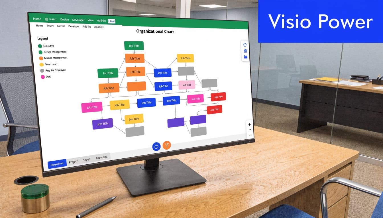
Org charts excel becomes much more useful for operations and training teams. You’re no longer creating a diagram as a one-off task. You’re maintaining a structured workforce view that can be refreshed when the underlying table changes.
What makes this method different
According to this Visio integration guide, advanced dynamic org charts using Visio Data Graphic integration support up to 1,024 nodes with refresh latency under 2 seconds. The same source notes that a CFIB 2026 report found 78% of Toronto-area SMB owners achieve zero-maintenance charts after setup, and that the method saves over 51% of time compared with manual creation for organisations with 200+ employees, with 97% accuracy when paired with a data connector.
Those figures matter because they describe the actual break point. At a certain size, charting stops being a formatting job and becomes a systems job.
A practical setup sequence
The exact buttons vary by environment, but the working process is consistent:
Prepare your Excel table with Employee ID, Name, Title, and Manager ID.
Confirm there are no duplicate IDs or orphaned manager references.
Open the Visio-connected charting workflow available in your Microsoft environment.
Map the table fields to the hierarchy structure.
Generate the chart.
Refresh the visual whenever the source table changes.
The most important habit is to keep edits in the table, not the finished diagram. Once users start “fixing” the visual manually, the chart becomes detached from the source and loses its reliability.
Where it works best
This method is especially useful when you need:
Frequent updates: Reorgs, seasonal staffing, franchise growth, or active hiring.
Large structures: National operations, multi-site teams, and layered management groups.
Operational consistency: One source feeding onboarding, training, and reporting views.
Professional output: Cleaner formatting than a hand-built spreadsheet diagram.
Some teams also pair these structures with reporting tools so they can analyse spans of control, training ownership, and team composition more effectively. If you're building that kind of reporting layer, the Professional Careers Training Power BI guide is a useful primer on how these visual and data models connect.
The best enterprise org chart is usually boring behind the scenes. Clean IDs, stable table structure, predictable refreshes.
Trade-offs you should know
This method isn’t perfect.
It depends on a clean data model, and that means governance matters. Someone has to own the employee table. Someone has to decide how vacant roles are represented, how dotted-line relationships are handled, and which fields are authoritative. If that ownership is fuzzy, even a strong visual tool won’t save the process.
There’s also a practical planning issue. Microsoft has published guidance on the retirement timeline for the Visio Data Visualizer add-in in Excel, so teams using it should review their environment and preservation options carefully before building long-term dependency on that specific add-in. The charting logic remains valuable, but the exact delivery method may need adjustment depending on your stack.
That doesn’t weaken the core lesson. Data-backed org charts scale. Manual diagramming doesn’t.
Pro Tips for Design and Professional Exporting
A correct chart can still be hard to use. If people can’t scan it quickly, it won’t help much in onboarding, training, or leadership reviews.

The visual standard should match the purpose. A leadership pack needs clarity and polish. A trainer may need role names and manager lines. An intranet version may need simplified department groupings. One chart rarely serves every audience equally well.
Make the chart readable first
Use these design rules before you worry about style:
Limit visible fields: Name and title are usually enough on the main chart.
Use spacing aggressively: Crowded charts feel more complex than they are.
Keep levels visually consistent: Equal hierarchy should look equal.
Use colour with restraint: Reserve colour for department grouping or emphasis, not decoration.
If you’re applying brand styling, use your organisation’s font and colour system sparingly. The chart should still work in greyscale when printed.
Fix the data issues before blaming the layout
A lot of “design” problems are data problems. If a branch looks wrong, the hierarchy values may be wrong.
A 2025 HRPA survey in Canada found that 74% of training directors report misalignment errors caused by improper Manager ID mapping in Excel org charts. The same source notes these errors can be reduced with XLOOKUP validation, and that over-reliance on manual shapes leads to a 28% rework rate after reorganisations, according to this Canadian Excel org chart guide.
A practical validation step is to use XLOOKUP to confirm that every manager ID resolves to a real person before you generate the chart.
Export based on where the chart will live
Different outputs need different handling:
For PowerPoint: Export as a high-quality image and test readability on a slide before the meeting.
For PDF manuals: Break very large structures into department charts rather than shrinking one giant version.
For intranets: Use a simplified chart with fewer visible fields.
For training decks: Add annotations outside the chart rather than overloading the boxes.
If the chart is going into presentation material, your formatting choices in Excel also affect readability later. Teams preparing charts for slides often run into spacing and label issues similar to other presentation formatting problems, so this guide on wrapping text cleanly in PowerPoint layouts is useful when you’re moving org-chart content into training decks.
Good org charts answer one question fast. Who reports to whom, and where does this role sit?
Quick troubleshooting checklist
When a chart looks off, check these items in order:
Problem | Most likely cause | Best fix |
Branch appears under wrong manager | Manager ID mismatch | Validate IDs in source table |
Chart is too wide | Too many direct reports on one level | Split views by function or department |
Boxes overlap after edits | Manual resizing or inconsistent layout rules | Reset sizing and re-align objects |
Connectors break | Plain lines used instead of connectors | Replace with snapping connectors |
Export looks blurry | Low-quality image handling | Re-export at higher quality or use PDF |
The chart doesn’t need to be fancy. It needs to be trustworthy, readable, and easy to reuse.
Choosing the Right Chart for Your Organization
The best org charts excel workflow depends on how often your structure changes and how much control you need.
SmartArt is the right answer when speed matters most and the chart is mostly static. Shapes and connectors work when the reporting structure is unusual and the visual needs to be customised heavily. A data table tied to a visual workflow is the right answer when the organisation changes often and the chart has to stay current without constant manual repair.
If your team is also thinking more broadly about structure design, this article on choosing ideal development team structures is a useful companion because the same logic applies. Structure should support execution, not just look tidy on paper.
For training and operations teams, an org chart is only useful when it improves clarity in actual workflow. That’s why it helps to think of it the same way you’d think about a process mapping example for operational clarity. The chart should make ownership, escalation, and training responsibility obvious.
If you’re building onboarding, compliance, or role-based training around changing team structures, Learniverse helps you turn those organisational realities into scalable learning systems. It can help your team create, update, and deliver training faster, without rebuilding everything manually every time the org chart changes.
